Reactions on Gather
WEB APP · CORE PRODUCT
OVERVIEW
Redesigned Gather's reaction experience to encourage and increase engagement
in meetings and conversations.
ROLE
Responsible for research and design leadership of the feature. Prototyped
interactions and worked closely with engineering to execute the details.
Team
In collaboration with Gaby Chan
TIMELINE
Aug 2022 - Sep 2022
Launched in September
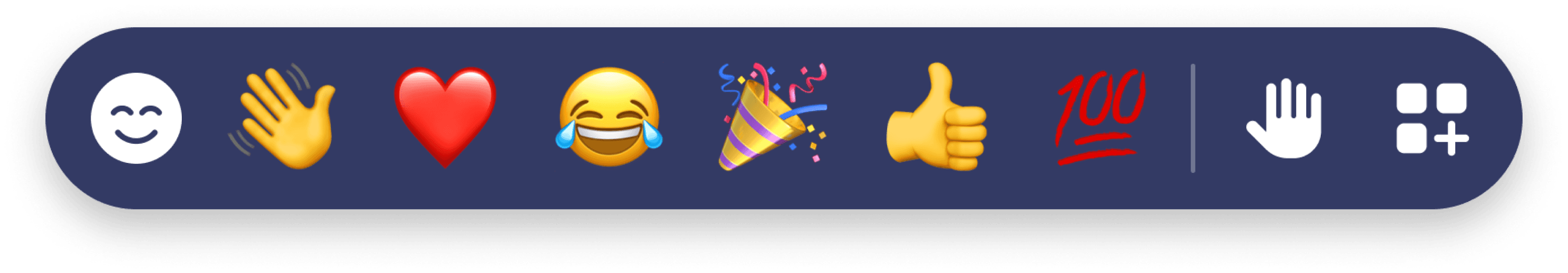
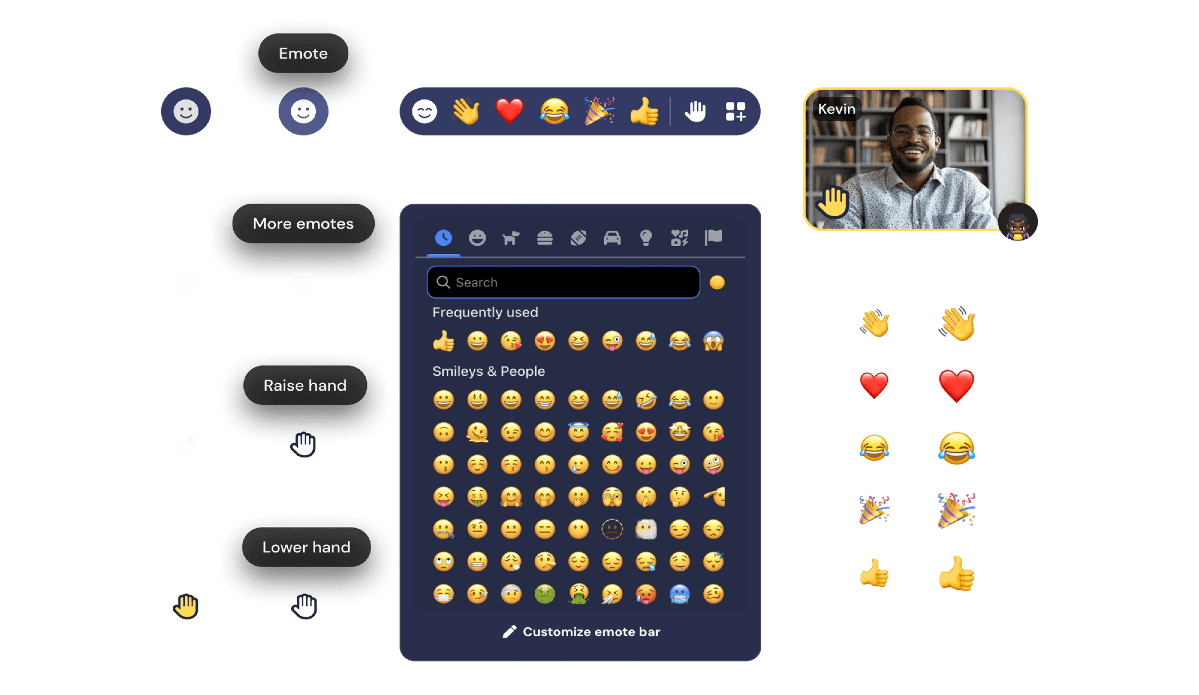
New and improved emote hotbar
With a 1-click emote bar, users can effortlessly wave, cheer,
or thumbs up their teammate when the moment calls for it.
01
Hover
Ready to explode with emotion
02
Spam
A release of high energy emotion

03
Raise Hand
Persistent and unmistakable from the rest
PROBLEM & APPROACH
How can we increase engagement & feedback in meetings?
Why is this important?
A team that is actively listening, supporting one another, and making
team decisions will not only lead to better employee retention, team
synergy, and camaraderie but better work outcomes.
We believe the reaction feature can help promote this in meetings.
But only 10% of Gather users emote
OUR HYPOTHESIS
Users are missing the moment to emote
Sending an emote was not top of mind or was tedious due to the
emote menu selection interaction. Preset emote options were
difficult to switch in the moment.
Users didn’t feel the impact of emotes
It was difficult to see emotes shared in larger meetings,
especially in screen share mode.
Defining the scope and direction 📝
High-level Goals
Help users instantly send the appropriate emote that
reflects what they are feeling in the moment.
Present shared emotes clearly to the speaker and audience
in all viewing modes.
Opportunities & Considerations
How can we motivate others to send emotes and create a
cascading effect of participation?
Considering the work environment, how can we bring fun
and energy to meetings without being distracting?
FEATURE AUDIT
Dissecting the emote menu 🔍
Legacy emote menu design
In Q1 of 2022, the design team overhauled the navigation system,
creating one single toolbar to house user controls and functions.
While most functions were redesigned, the emote menu remained
untouched and dropped into the new toolbar until this dedicated
project came along.
What wasn’t working?
Didn’t enable spontaneous reactions
The emote menu was hidden unless hovered which reduced
overall awareness and usage. Sending an emote through the
menu took 3 steps due to the hover pop-up menu interaction.
Raise Hand was not like the rest
Raise Hand was a persistent emote while the rest were
temporary. This emote behaved differently but looked like the
rest. Clicking the X button to lower their hand wasn't clear.
Offered a limited range of emotions
With only 5 emote slots, users couldn’t practically express a wide
range of emotions in a conversation. Sending an emote not on
the preset list required overriding a preexisting one.
Where were emotes shared? 📥
On video tile
Emotes were displayed on the user’s video under their name tag
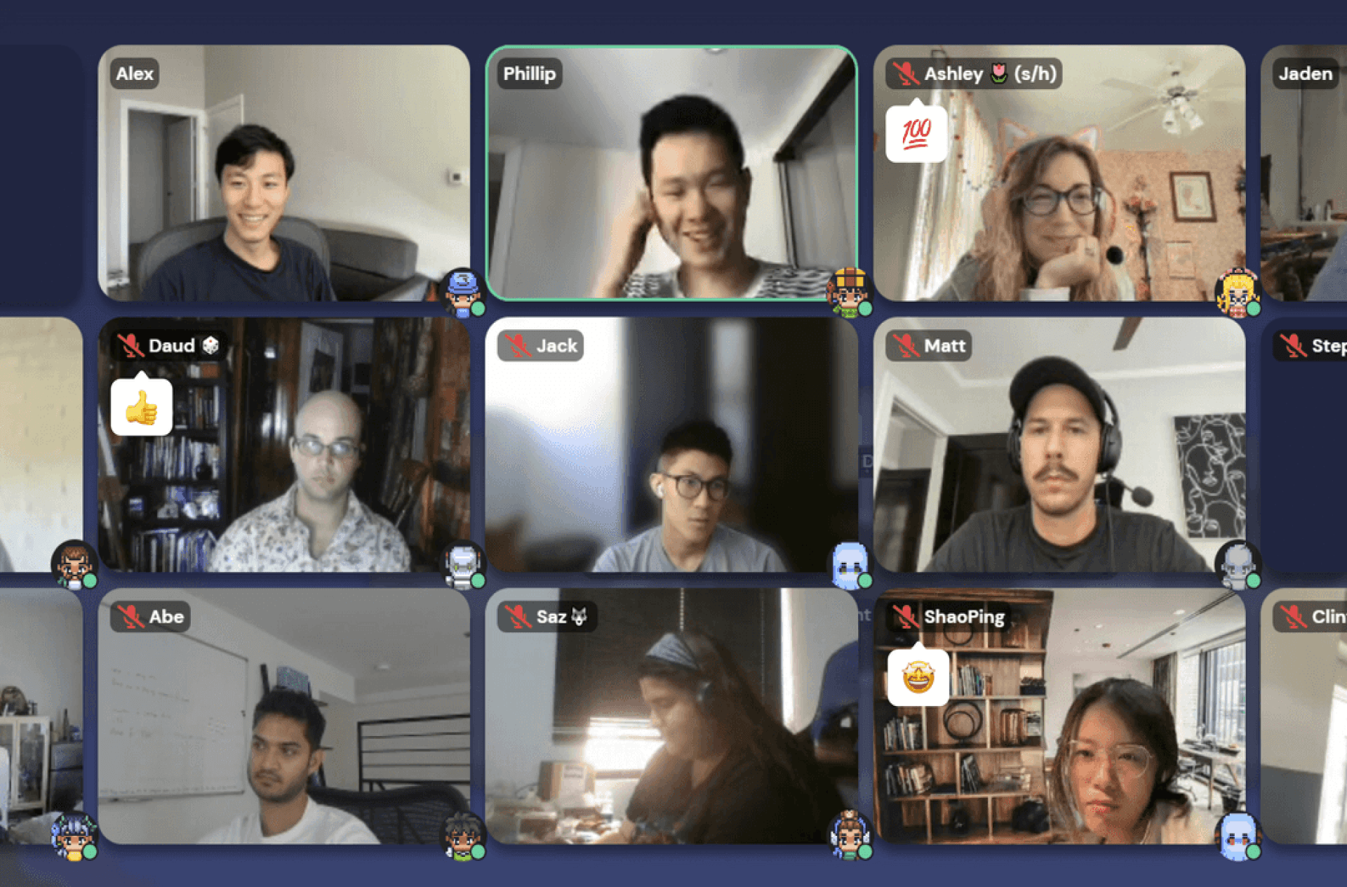
✦
Emotes could be easy to miss as they are spread across the
screen around lot of visual distractions
✦
In larger groups, user videos were hidden in the carousel
resulting in no visibility of shared emotes or raised hands
On map
Emotes were displayed above the user’s avatar on the map
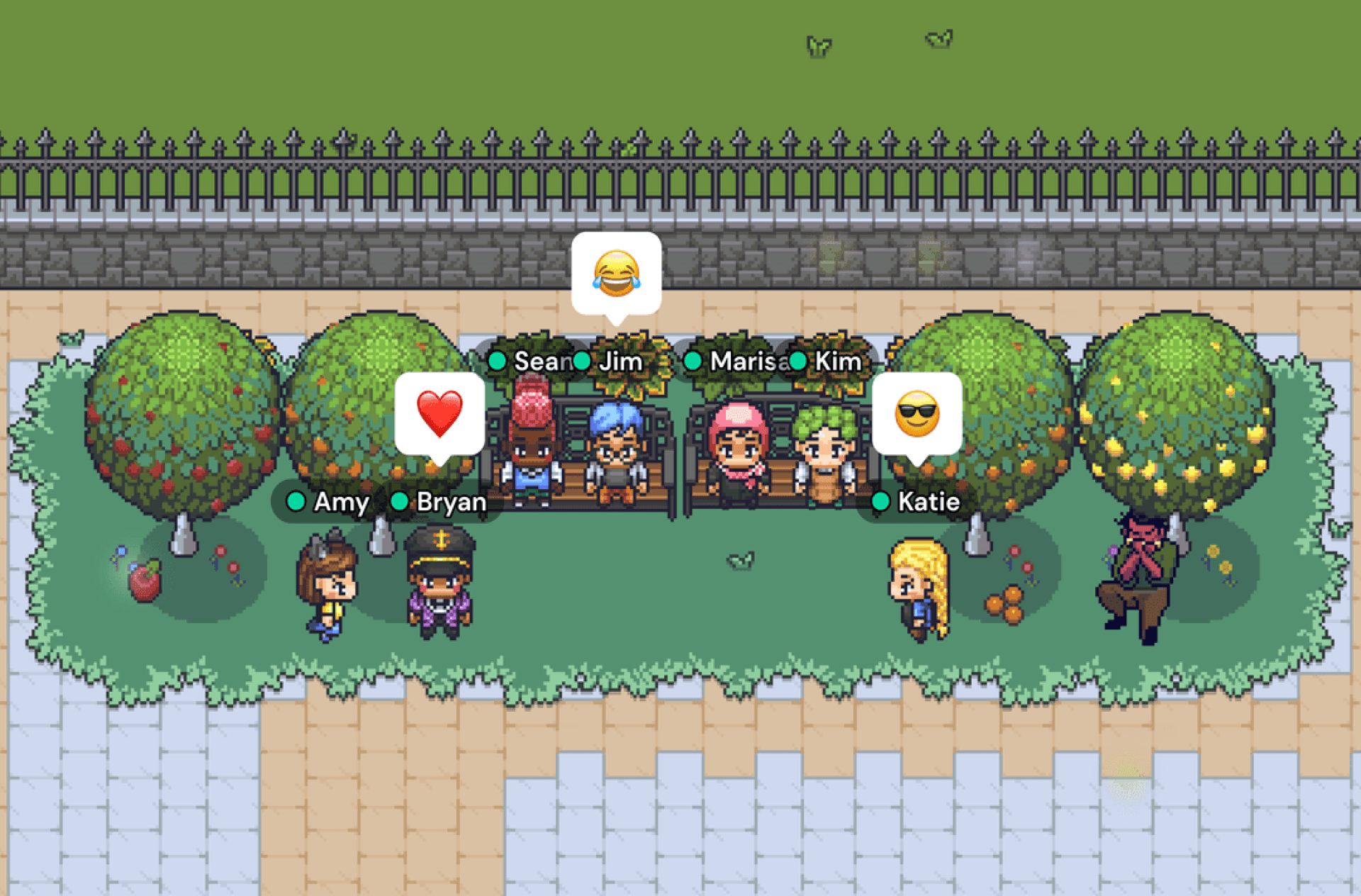
✦
Easy to see everyone’s reactions at a quick glance but could
be hard to see who is emoting if crowded with avatars
✦
Most meeting conversations were not held in this mode, but
rather in meeting or screen share mode
Design proposal
Sending reactions 💬
Changing the form factor
With the launch of the new navigation system, the full length toolbar
opened up more options for the design of the emote menu.
However, my early design ideas led to variations of same old pop-up
style emote menus. I felt I wasn't addressing the desire for a 1-click
emoting experience. I then started to explore a form that fit into the
toolbar itself and the rest was history.
ORIGINAL
Pop-up Menu
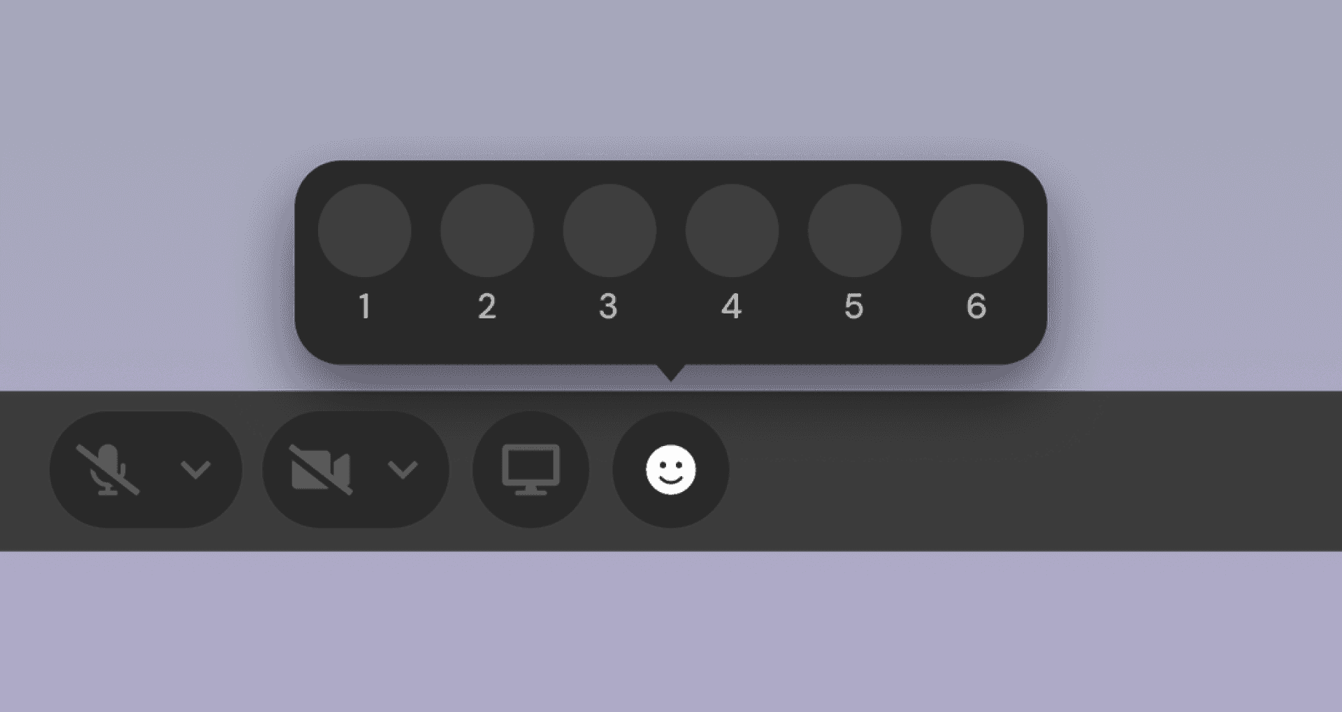
✦
Hidden and required 3 steps to send an emote
✦
Not as scalable and blocked some of the canvas
✦
Can only send one emote at a time as menu closes after
each emote is sent
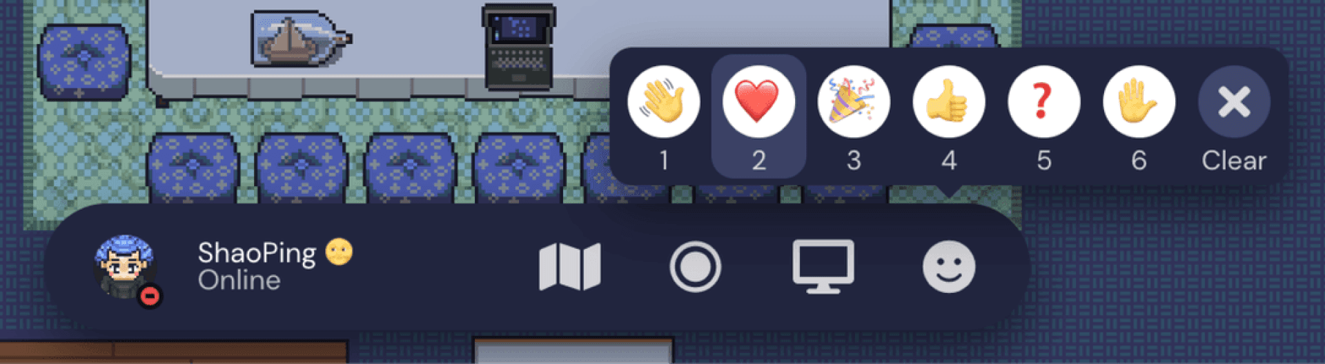
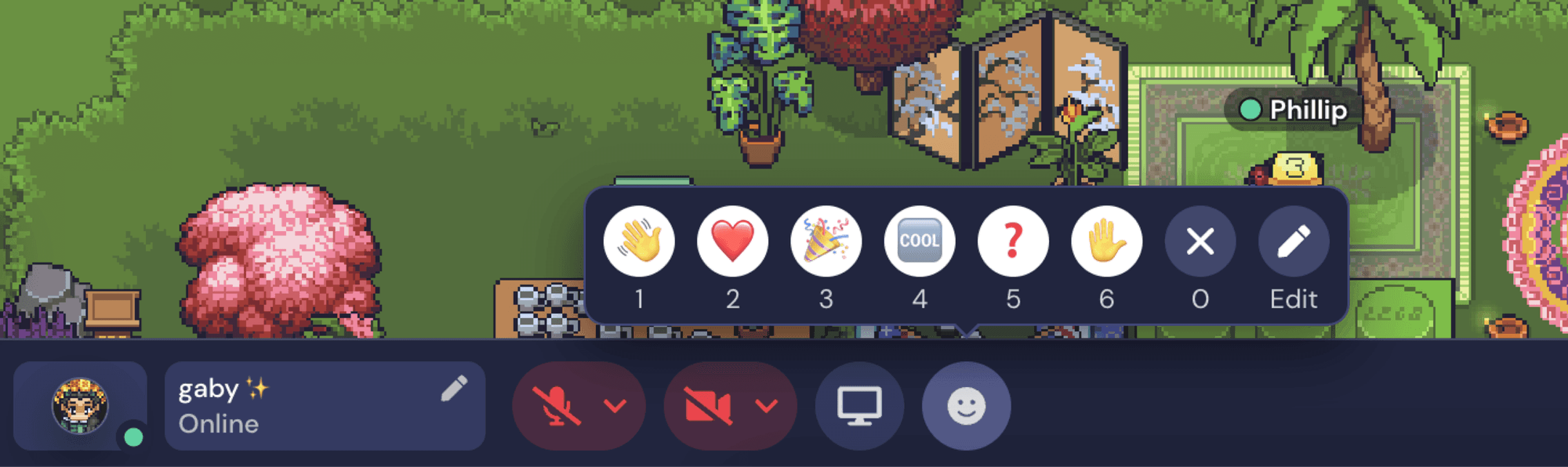
UPDATED
Hotbar Drawer
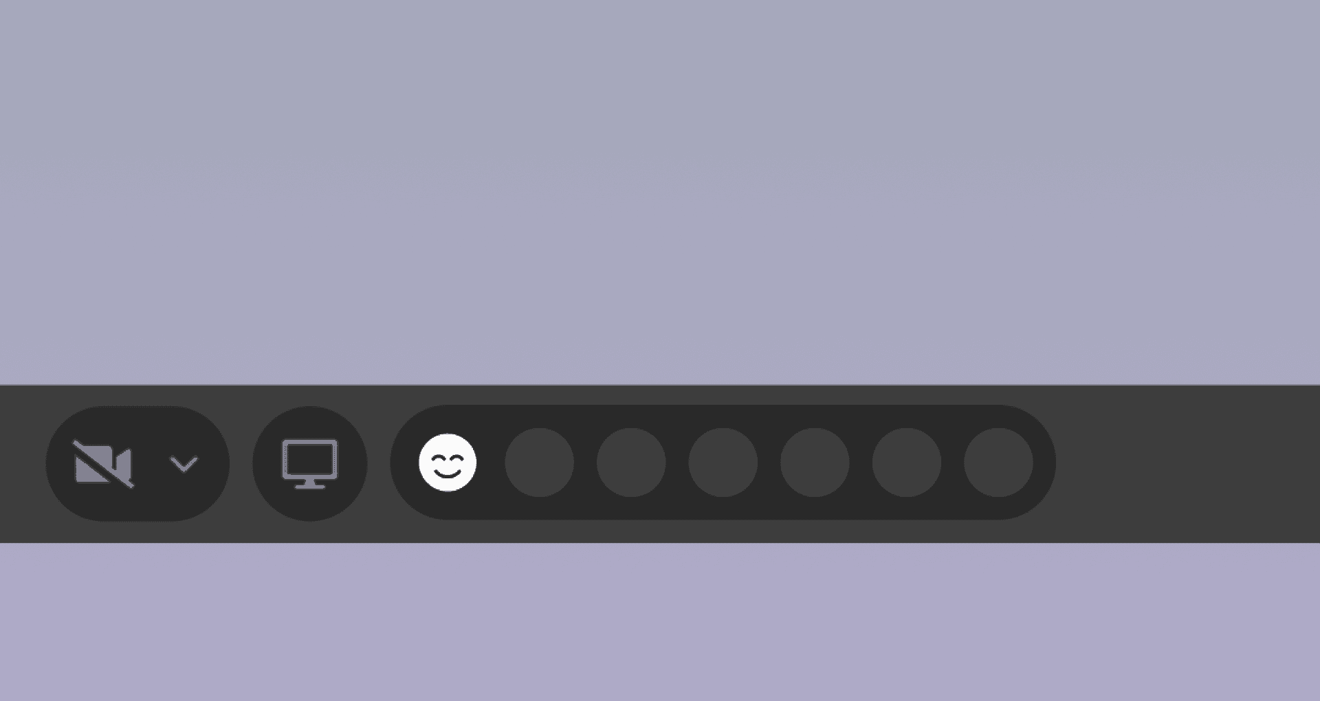
✦
Share favorite emotes in 1 click
✦
Menu is open by default to encourage emoting but can be
collapsed if desired
✦
Enables emote spamming similar to the hotkey function
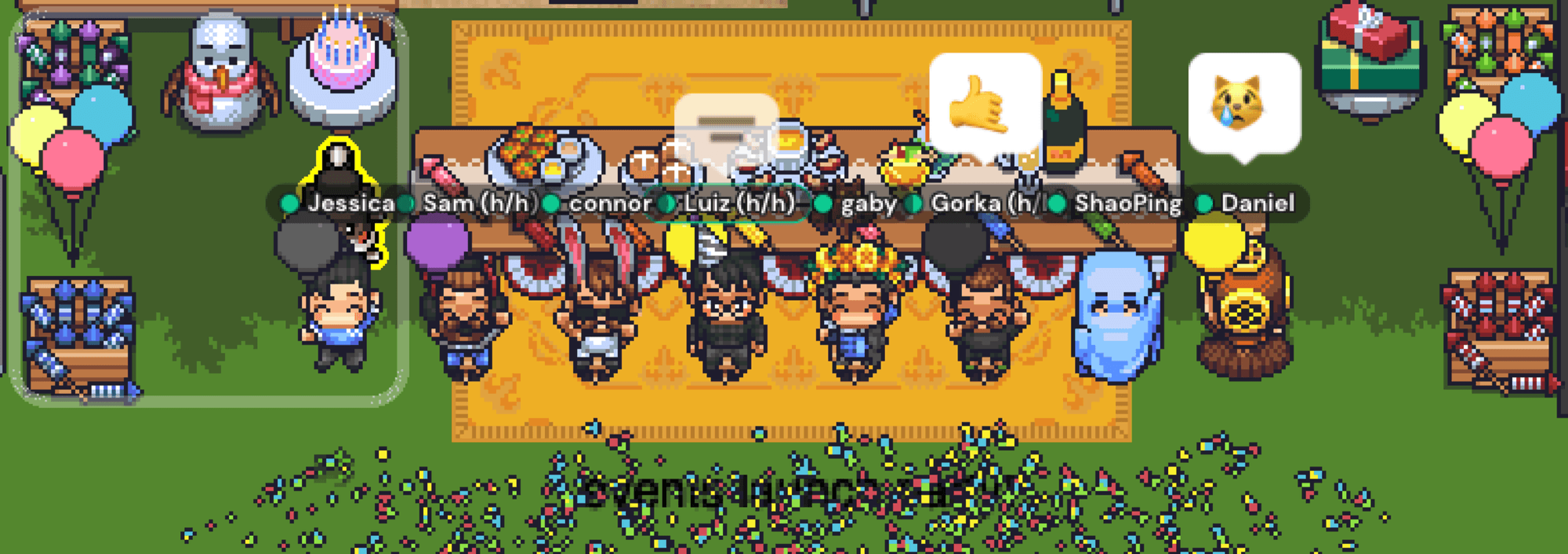
Displaying reactions 👀
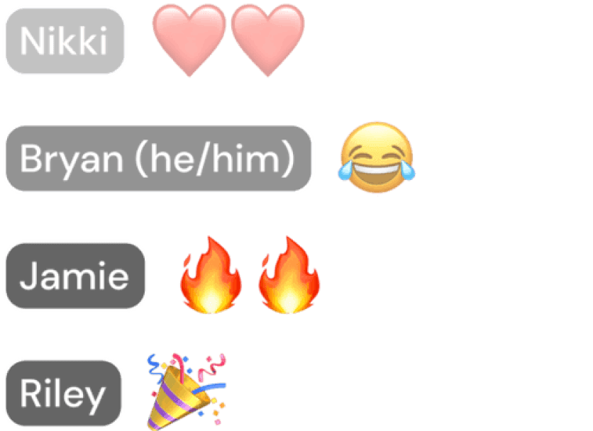
Proposing the Reaction Feed
The existing emote placements work for certain use cases, but for not
larger group meetings. In this case, shared emotes are scattered and
possibly hidden from everyone’s view.
I proposed adding a localized visual feed of all emotes shared during a
conversation and ideated a bunch of concepts.
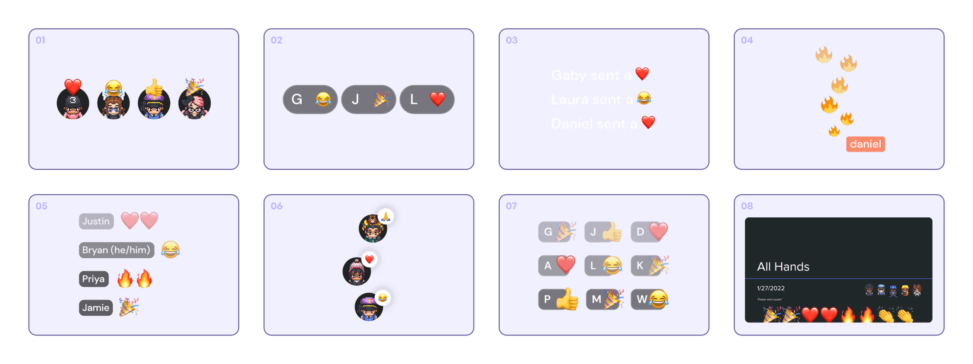
DOWN-SELECTION CRITERIA
✦
Must easily recognize who sent the emote; Display name
was more recognizable than avatar or initials
✦
Must be able to display multiple emotes at a time to enable
button spamming and show emphasized emotion
✦
Must be easily scannable; Stacking vertically was easier to
read at a fast pace
FINAL DESIGN
I landed on reusing the user video name tag design as it mirrored what
users are used to seeing on the platform, kept the design components
consistent, and saved development time.
I chose to display up to 4 user’s emotes at a time as it felt like an easy
amount to scan and has a small footprint on screen.

Finding the Reaction Feed a home
Explored many different placements for the reaction feed on the
screen and tested them in the different viewing modes.
I opted for anchoring the feed in the left bottom corner of the screen as
this area was free from any existing UI and avoided blocking screen
share presentations and user videos.
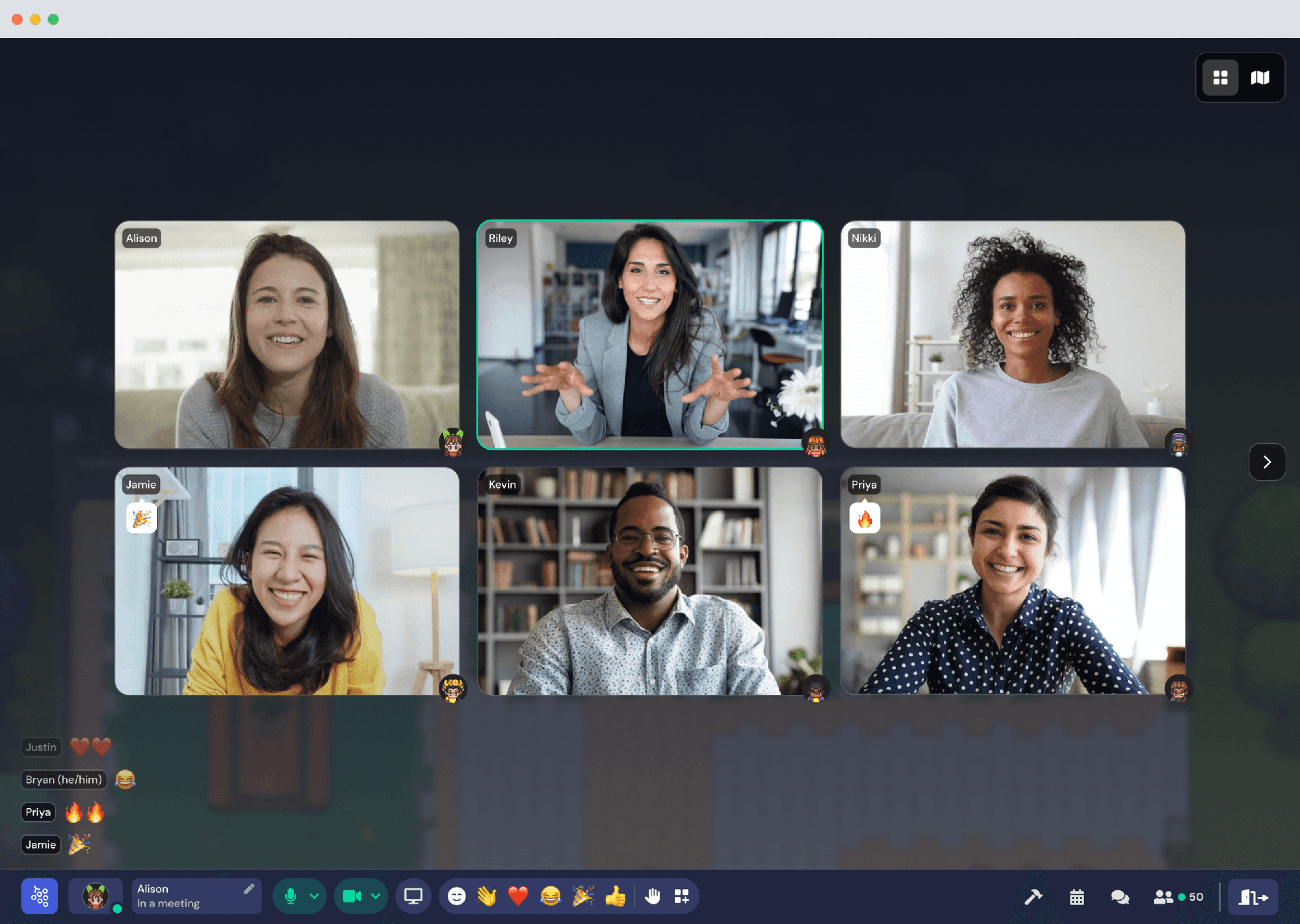
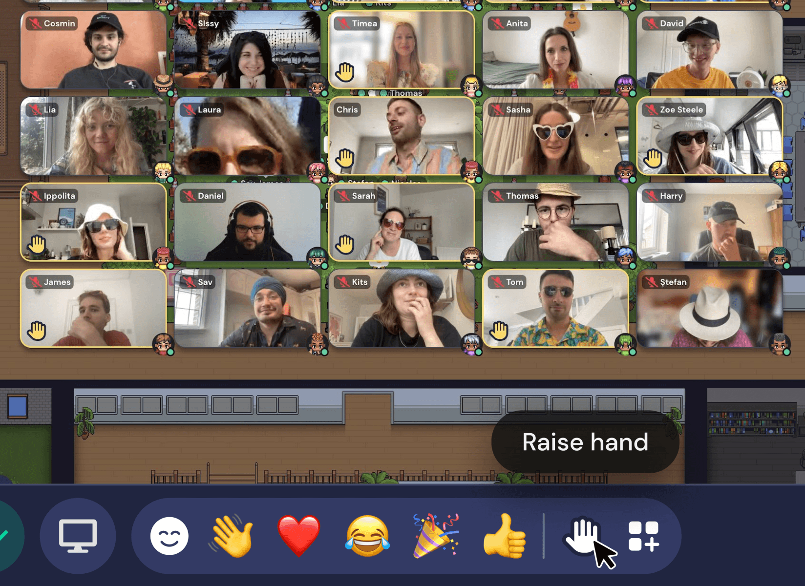
Feed Architecture & Prioritization
To bring more visibility to raised hands, I added persistent visual
indicators on the video tiles and participants list, as well as moved up
the position of their video in the carousel list. The reaction feed
features the raised hand emoji temporarily like a normal emote.
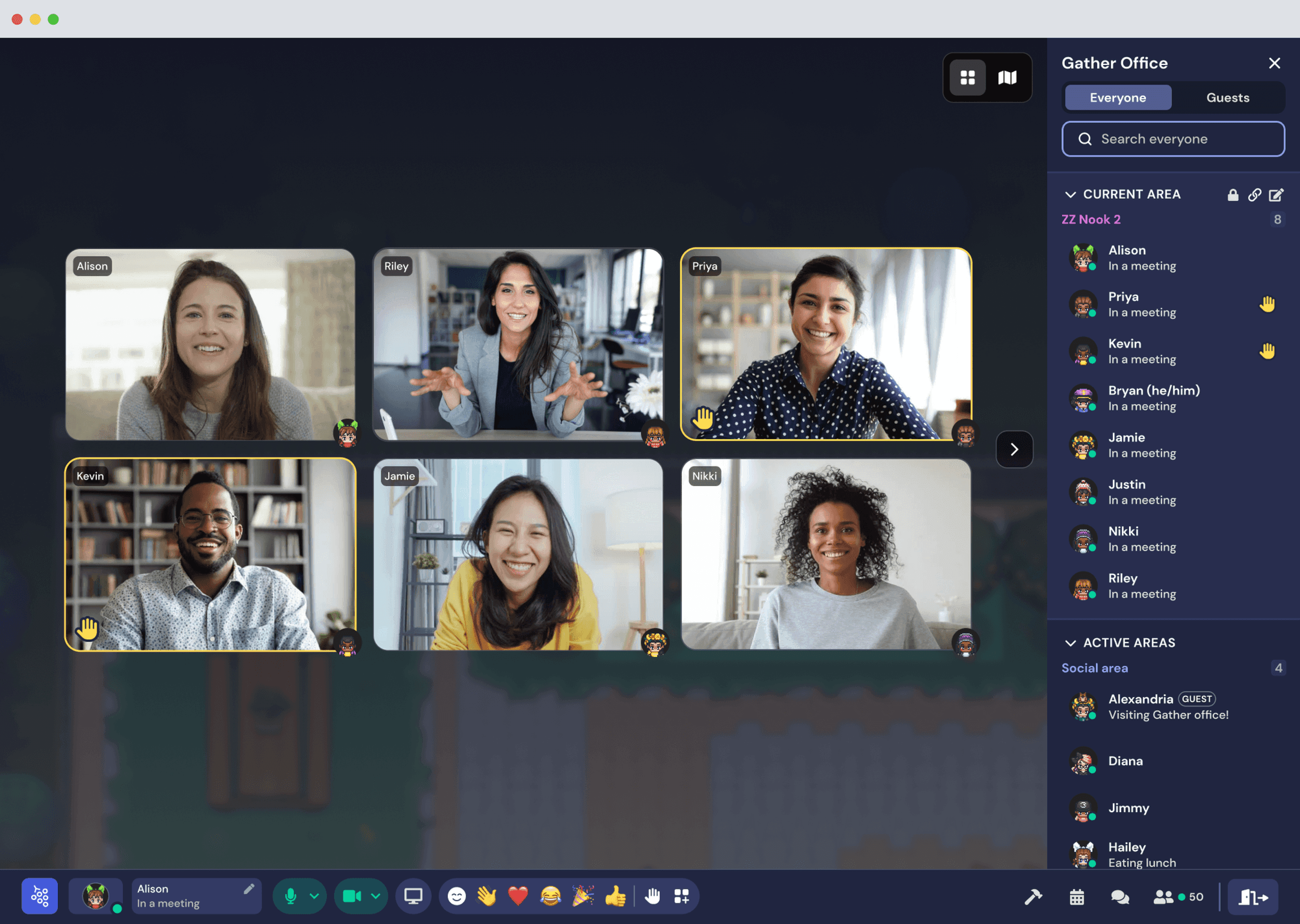
Raised Hands – Meeting View
DETAILS & REFINEMENT
Making reactions feel sleek & magical.. ✨
Outlining the components
Working off the new Gather navigation design patterns, I designed the
components, states, and visual indicators.
OUTCOMES & ITERATION
After launch, we saw a 50% increase in users emoting 🔥
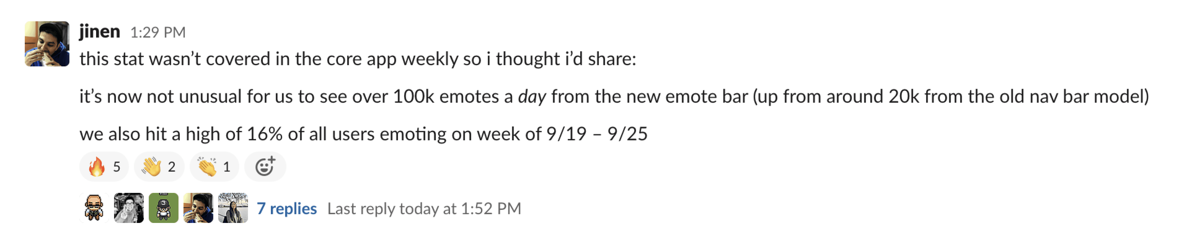
Looking at 8 months of data -
⬆ 15%
of all users emote
Up from 10% from the old emote design. Shows an increase in
awareness and interest in emoting during conversations.
⬆ ~800k
emotes every week
The number of emotes shared every week jumped from 200k to
800k on average. The visibility and spammability must of made
emoting addicting.
⬆
Both input methods outperform old model
Emote bar usage skyrocketed with no drop off in keyboard input
usage. Even though keyboard shortcut indicators were removed,
keyboard input usage for emotes only increased.
Tweaking Community Reactions (CR)
😐 11%
of emoters experience a CR
This was lower than expected which may point to a
discoverability issue
We realized it was much easier to hit the threshold to trigger the
Community Reaction effects in smaller group conversations compared
to larger meetings.
In April 2023, we made adjustments and the number of emoters
experiencing a CR increased to 23%.
Demand for more emote slots
We received great interest from the community and within our own
company to increase the number of emote slots available. Users
wanted more options loaded into their hotbar to react with!
So we increased the number of slots from 5 → 7

© 2024 Laura Cisneros
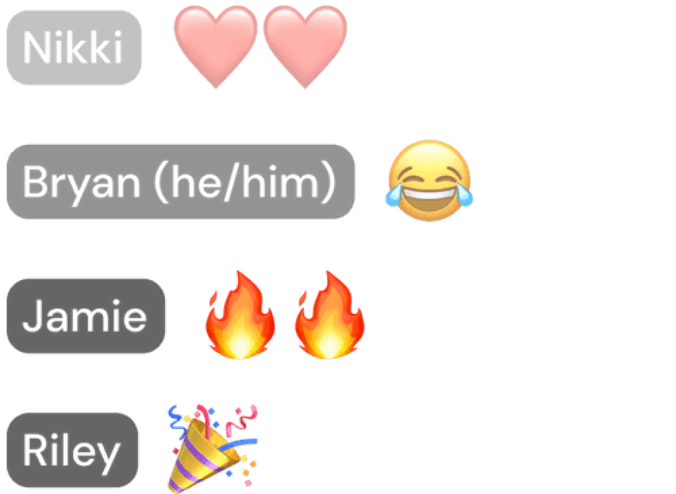
A new place to view reactions
Catch all shared emotes in the new designated
reaction feed and trigger a Community Reaction
when multiple users share the same emote 🎉 ️.
Raise your hand
Participate more in meetings and never miss a raised hand
with the improved raise hand feature.
© 2024 Laura Cisneros